More Than Eye Candy: Data Visualization and the Communication of Information
by Elisa Shoenberger
Issue 3: Knowledge | 1,384 words
Editors’ Note: This essay features significant spoilers for Robin Sloan’s novel Mr. Penumbra’s 24-Hour Bookstore.
It seems that every action we take these days creates mountains and mountains of data. We create data when we browse online, read articles, buy products and services, and even when we walk. With the leaps and bounds in data accumulation, data visualizations have followed. These visuals help us look at information in new ways to create insights and breakthroughs.
While data visualizations help us understand information in new and innovative ways, overreliance and uncritical acceptance of them can be problematic, as evidenced by Robin Sloan’s 2012 novel Mr. Penumbra’s 24-Hour Bookstore, as well as the work of Brooklyn-based artist Mimi Onuoha.
Data visualizations—or, as commonly shortened, data vizes—are not recent inventions. They come in many forms, such as bar charts and scatter plots. Even maps are included in the rubric. Michael Friendly’s Milestone project examines data visualizations back to the first known maps around 6200 BCE. The project then identifies 1850 to 1900 CE as the “Golden Age” of visualizations due to the rise of statistics.
While maps and charts can be aesthetically appealing, data visualizations are more than eye candy. Advertisers and newspapers use them in part because of their ease in informing complex ideas to readers. Data vizes help people make insights that can otherwise be hidden in a spreadsheet of data.
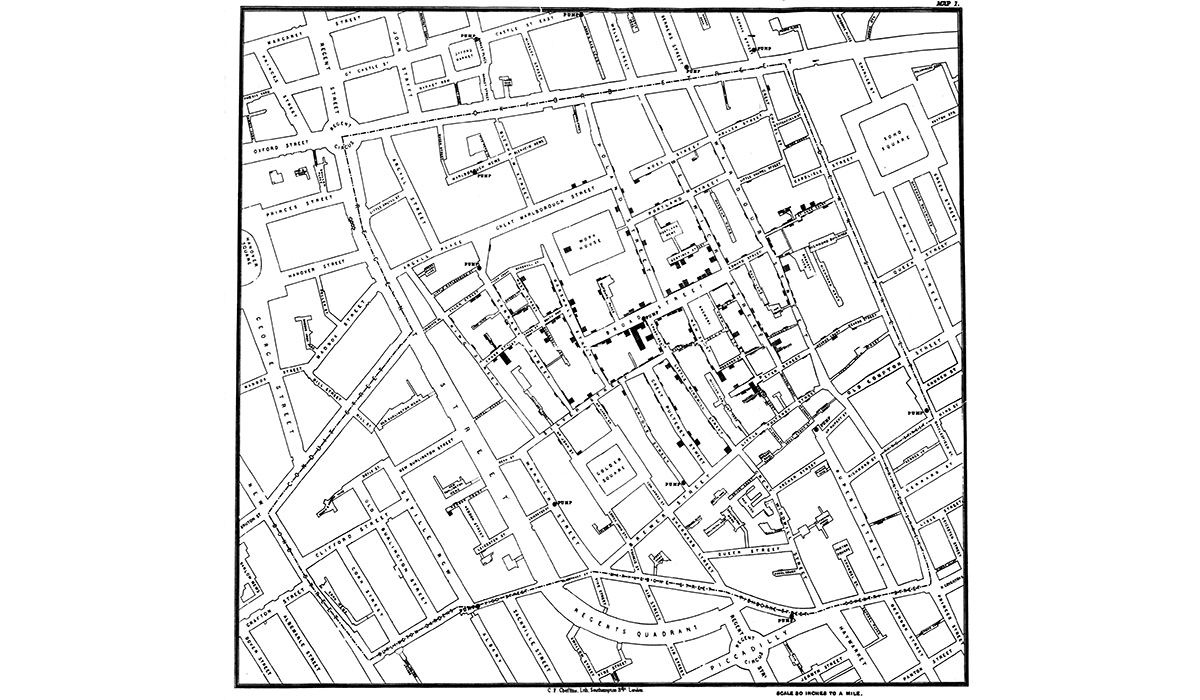
One of the most illustrative uses of data visualization is seen in the work of Doctor John Snow. In 1854, a Soho neighborhood of London suffered from a cholera outbreak. Doctor Snow plotted the cases of cholera on a map of the neighborhood and found that the rates of disease seemed to surround a simple water pump. After closing the pump, the number of cases began to diminish.
But not all data visualizations need to be used for investigative study; they can be valuable tools used in daily life, like with transportation. At the beginning of the 20th century, London’s public rail system, the London Underground, was prolific but hard to manage. Due to the size covered by the Underground, maps were confusing and not easily portable.
In 1931, Harry Beck, an electrical draughtsman for the Underground, devised a simplified map that resembled an electrical circuit diagram by clearly demarcating the train lines, their stops, and the River Thames. The map did away with showing the proportional differences between stops and became an item that could be carried and used every day. The Underground management wasn’t sure about the usefulness of the map and initially only printed 500. Proving very popular, they ended up printing 700,000 in the following year. The map provided a new way of charting the Underground lines and stations and has evolved to the iconic design we see today.
In the world of fiction, Mr. Penumbra’s 24-Hour Bookstore explores the power of data visualization. In a pivotal part of the book, the protagonist and overnight clerk at the bookshop, Clay Jannon, decides to make a 3-D rendering of the bookshop, including all of its shelves and books, and then scans the logbook that records all books borrowed and by whom. He brings the two datasets together and accidentally discovers an image of a face in his 3-D map. Jannon soon learns that he has accomplished in mere days what novices of the mysterious fellowship called the Unbroken Spine spend years attempting. The fellowship is trying to decode a Codex Vitae, or book of life, that holds the secret to eternal life. The Codex is printed in a special font called Gerritszoon. The dutiful novices of the Unbroken Spine methodically work through the bookshop’s stock, decrypting each book slowly. Jannon solves the problem, albeit accidentally, by mapping the data out and creating a visualization of the store.
While data visualizations can be extremely useful, they have limitations. Since they are easy to consume, the opportunities to mislead viewers rise. There are numerous ways to intentionally and inadvertently skew data visualizations, such as by changing the scale of charts, playing with horizontal and vertical axes, and using clutter. Business Insider’s “The 27 Worst Charts Of All Time” presents several problematic graphs. One, from Fox News, shows job loss by quarter, but, as Business Insider highlights, the points are not in regular intervals or a straight line, nor is there a vertical-axis. In another Fox News chart showing border apprehensions in the Southwest U.S., only three years of data had been used, leaving out data showing apprehensions decreasing in 2008.
The understanding of data visualizations is compromised when there are missing data sets or data points. Mimi Onuoha, a Nigerian-American and Brooklyn-based artist, has been concentrating on the dilemma of missing data sets. In a study, she compares, side by side, Google Maps and satellite imagery of particular locations in Nigeria, Chad, Mongolia, and Brazil. She discovers that Google Maps fails to show specific types of information and key features of the cities in certain regions of the world (e.g., Africa and parts of Asia and Latin America). For instance, only 26 of 1000 favelas had been mapped in Rio de Janeiro, Brazil. This missing data can have huge consequences for people and places that don’t appear. Such maps with omitted information can lead people into thinking that the places depicted are devoid of development or any substantial features. Onuoha identifies four reasons for missing data: power asymmetry—people and organizations can collect data, but choose not to or don’t release it; difficulty in data collection—collecting data is harder than the benefit of having it; resistance to metrification—some data defies measurement or categorization; and the benefit of nonexistence—missing data can protect.
••••
While Mr. Penumbra’s 24-Hour Bookstore presents a great example on the effectiveness of data visualizations in revealing information, the book later gives a poignant critique on how obsession with data visualizations can make people miss important information. After mapping the store, Jannon and his friends take a version of the Codex Vitae and use the incredible computing power of Google to try to further decrypt the text. The Google team uses maps, cubes, and chemical reactions, but nothing reveals the meaning of the code. They even use the entire Google system—the big guns— but they find nothing. His date/girlfriend and project manager of the project explains, “Yes, [we used] everything. Clay: we just dialed in the equivalent of, like a million years’ worth of human effort. It came up empty… There’s nothing here.”
Everything seems to fall apart. But then, Jannon ends up tracking down the original punches of the Gerritszoon font and realizes that they were the key to the Codex. Jannon says, “Nobody in the fellowship’s five-hundred-year history thought to look at this closely. Neither did any of the Google’s code-breakers. We were looking at the digitized text in a different typeface entirely. We were looking at the sequence, not the shape.” No one had seen what was literally in front of them. The font had been digitized and, thus, the meaning had been lost. With the unique Gerritszoon punches, the font contains the code to the Codex and reveals the creator’s memoirs. But there’s more. Jannon realizes that Gerritszoon is found everywhere in modern life—in newspapers, term papers, and even the bookstore’s sign. The font was immortality itself, still in use 500 years after its creation.
In this final denouement of the book, the message is clear: data visualization is useful in uncovering knowledge—there are things that can be learned from charts, graphs, and maps. That’s evident with Berk’s and Snow’s maps. However, the complete focus on data visualization can cause people to miss what is in front of them. As Mimi Onuoha noted, not all data can be metrified. Sloan’s book goes beyond that, focusing on the unique data, even if it’s a set of font punches. Sometimes you have data that is so unique, so special, that you miss it if you aren’t paying attention, as the Unbroken Spine and Google team do.
While data visualizations can be extremely useful in presenting data, they can also mislead people when data is missing or unavailable. And if visualizations are offered by widely used sources, like Google, the consequences of what is missing, intentionally or unintentionally, are magnified. It’s not always about plotting the data points, but about seeing the points for what they are.

Elisa Shoenberger
Elisa Shoenberger is a writer and journalist in Chicago. She has been published by Boston Globe, The Rumpus, Ozy, Curbed, Brainfacts.org, Electric Literature and much more. She writes regularly for Book Riot and the Book and Paper Fair Blog. She is the co-editor and co-founder of The Antelope Magazine, a journal of oral history and mayhem. In her spare time, she plays alto saxophone, makes cheese, and stiltwalks.